SPayLater Credit Revamp: eliminating confusion and building user trust
I redesigned Shopee PayLater's Credit Page to help users clearly understand their credit limits—both temporary and permanent—reducing confusion during sales events and cutting down on customer support inquiries. The solution was validated and approved for development.
Role
Product Designer
Timeline
3 months (Sep - Nov 2024)
What I Worked On
UX research, mid-fi wireframing, design iterations, usability validation
Teams Involved
Product Manager, Business Development, Senior Designer

SPayLater: making larger purchases more accessible—without compromising trust
SPayLater is Shopee's BNPL product in Indonesia, enabling users to pay over time for purchases—from daily essentials to higher-ticket items—through a simple, mobile-first checkout experience that balances conversion with trust, risk controls, and repayment clarity.


What's the problem?
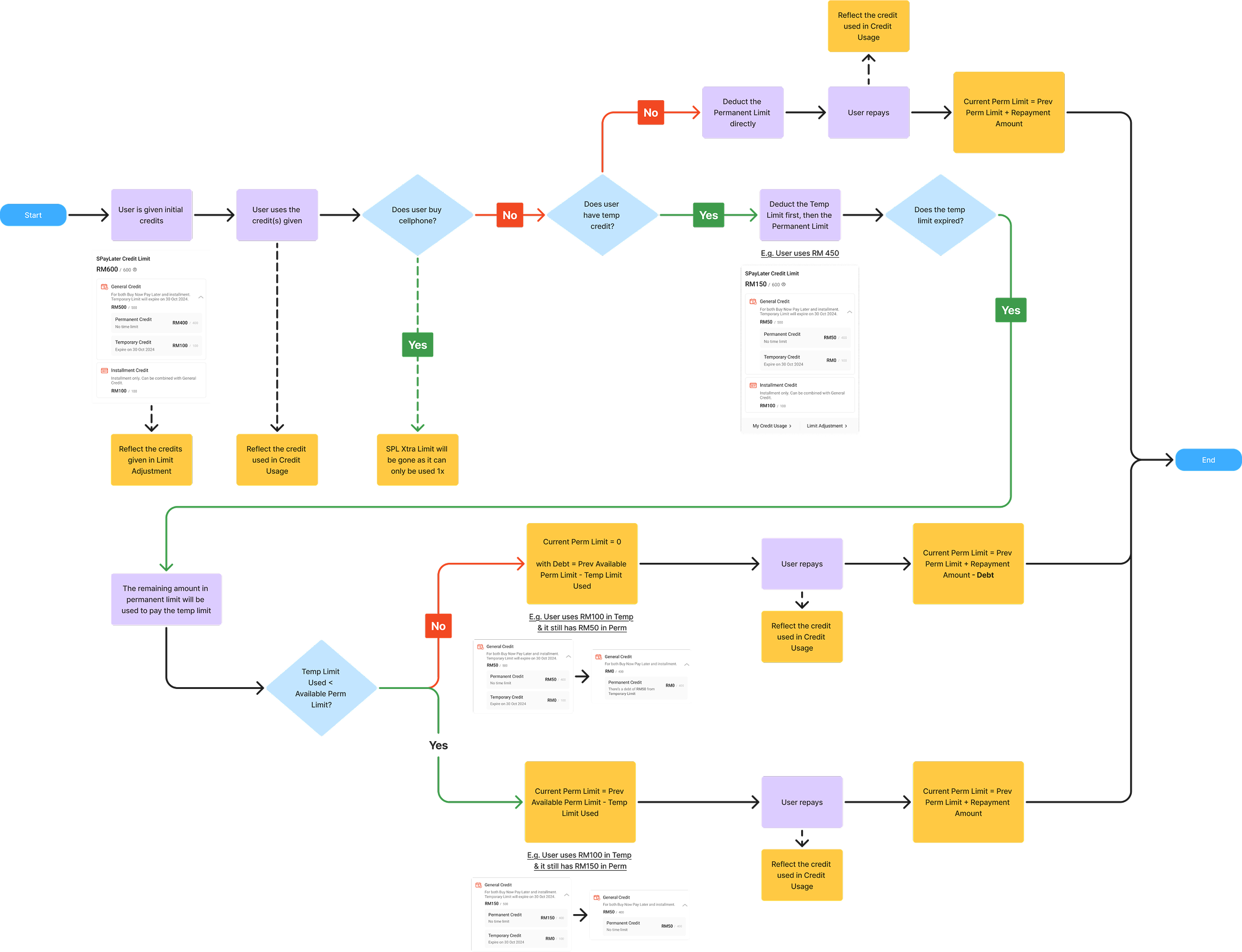
In June 2024, over 800,000 customers across Southeast Asia reached out with complaints about Shopee PayLater's credit limits, mostly during significant sales events where temporary credit boosts—each with different due dates and repayment terms—left users confused about their actual borrowing power.
So, the challenge becomes...
How might we help users clearly understand which credit is being used, how it is deducted, and provide easy access to a transparent history of credit changes and repayments?
and... what's the outcome
Outcome
I delivered a redesigned Credit Page that clearly distinguishes temporary vs. permanent limits, shows credit used by type, and introduces a dedicated Credit History log. The final design was validated and approved for development by the Senior Designer.
Why did we focus on Malaysia first?
Since Malaysia had the lowest percentage of complaints (2.6%), we focused on solving the issue there first, allowing us to test, refine, and validate our solution before scaling it to larger markets like Thailand (21.5%) and Vietnam (21.4%).
70.53%
Struggled with credit limits
Users couldn't understand their historical, current, and future credit limits clearly.
24.91%
Confused about deduction order
Users were unclear about credit limit deduction order and interest rate differences.
0.46%
Zero balance confusion
Confused why their credit limit showed zero, even after repaying their loan.
Design Principles
To guide our design decisions while keeping all stakeholders aligned, we defined our design principles.
Simplify Complexity
Financial products can be complex, but the UX shouldn't be. Reduce friction and make key information instantly digestible.
Information Hierarchy is Key
Users scan, not read. Prioritizing critical details improves comprehension and decision-making.
Instant Clarity
Loan breakdowns should be understood at a glance, not through effort. Progressive disclosure & visual cues help streamline comprehension.
Goal & Success Criteria
What we aimed to achieve...
Metric 1
Reduction in credit-related customer service inquiries after the redesign.
Metric 2
Faster credit breakdown comprehension—users find and understand their credit breakdown quicker.
Metric 3
Increased engagement with credit limit management and credit used features.
Success Signals
- ✅
Users can explain their credit breakdown without confusion
- ✅
Reduced back-and-forth navigation to understand credit status
- ✅
Clear visibility into credit history and limit adjustments
Design Exploration: Part 1
Mid-fi Wireframing
Since this wasn't a full-page redesign but rather an enhancement of an existing structure, our approach focused more on UX than UI. We started with mid-fi wireframing, leveraging existing components while iterating to improve user comprehension.
Component Updates:
Visual & Interactive Improvements
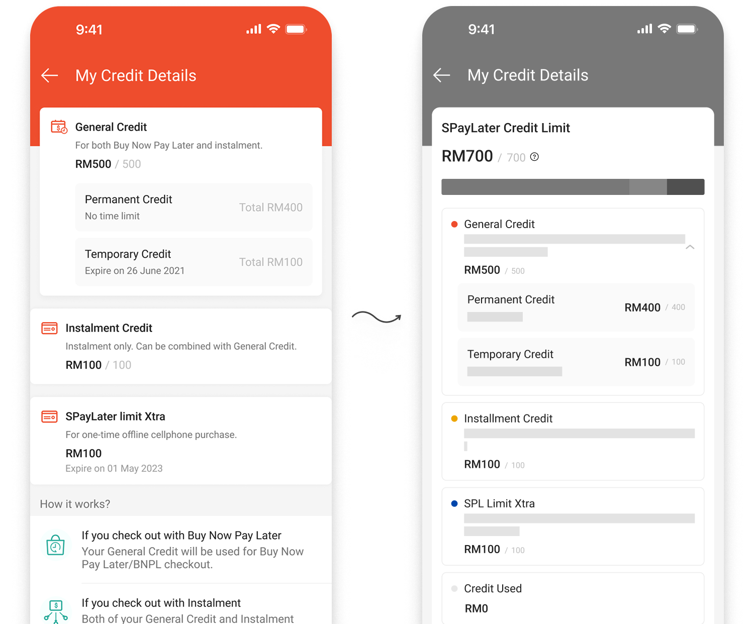
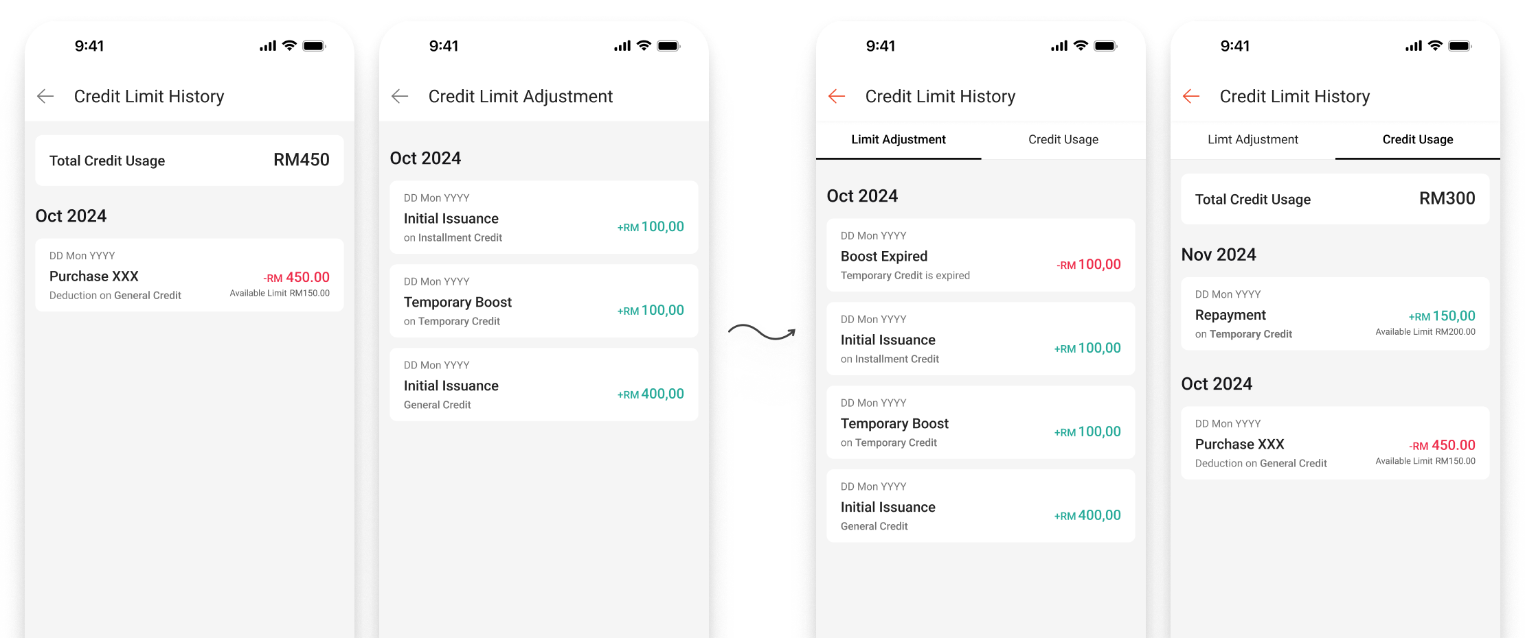
Added a bar chart to visually represent credit limits, dropdown for credit details to reduce cognitive load, and displayed available limit / total limit in every breakdown for consistent clarity.
What worked ✅
- • The dropdown prevents users from being overwhelmed by information
What didn't work ❌
- • When users use temporary limit and haven't repaid, the Available Credit = Total Credit - Credit Used logic causes cognitive bias
- • Doesn't address limit adjustment well
- • Bar chart visual can be misleading based on edge cases
Design Exploration: Part 2
Refining the Flow
After the first iteration, we improved information visibility, but users still struggled with credit flow clarity. We collaborated with PM & BD teams to refine the user flow and adjust key visuals for better understanding.
Key Changes:
Visual & Structural Refinements
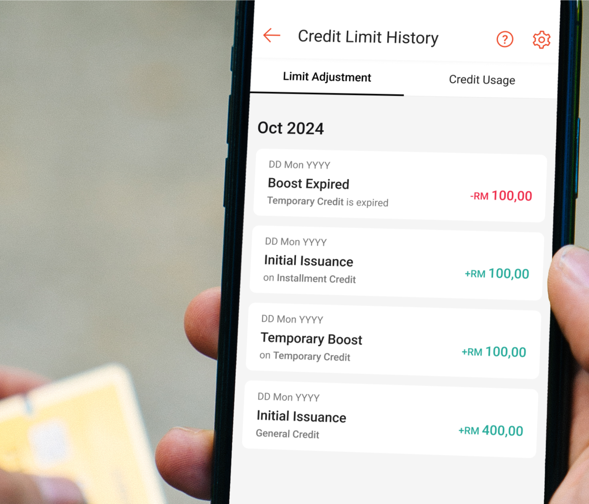
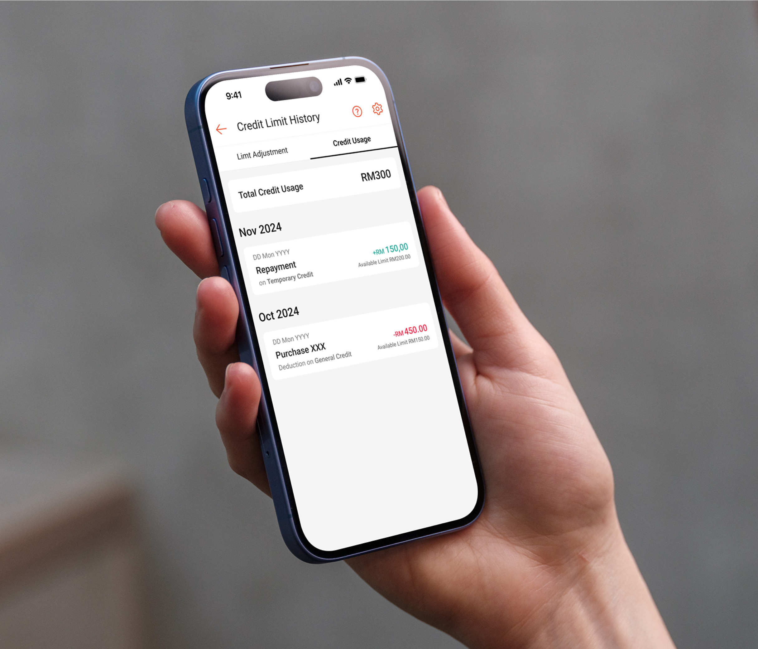
Removed the misleading bar chart, grouped General & Installment Credit following Law of Proximity & Similarity, and added buttons for Credit Usage & Limit Adjustments for detailed explanations.
What worked ✅
- • Logical flow improved clarity following Doherty Threshold principle
- • Chunking information effectively made scanning easier
What didn't work ❌
- • Design needed further simplification to reduce friction
- • To compare credit used and limit adjustment, users had to go back-and-forth
Design Exploration: Part 3
Finalizing Wireframes
By the third iteration, we focused on further reducing cognitive load, improving visual representation, and simplifying navigation. Based on new product requirements, we also incorporated an entry point for users to increase their credit limit directly.
Final Updates:
Polished Components & New Features
Added tabbed layout for seamless switching between 'Limit Adjustment' and 'Credit Used', prioritized temporary credit display since it expires, and added a semi-circle bar chart with entry point to 'Increase Limit'.
Final Design
The final design delivers a clear, scannable Credit Page that distinguishes temporary vs. permanent limits, shows credit history, and provides easy access to limit increase options—all while maintaining the existing Shopee design system.

Results & Impacts
Here's what we achieved during the design phase:
✅
Approved for Development
The final design was validated and approved by the Senior Designer, meeting both UX and business requirements.
📅
Project Timeline Update
Initially scheduled for an earlier release, the project was reprioritized due to other high-impact initiatives.
📈
Projected Business Impact
The redesign aims to cut credit-related inquiries, enhance feature discovery, and build user trust through better credit management.
Key Learnings
Simplify Complexity
Financial products can be complex, but the UX shouldn't be. The goal is to reduce friction and make key information instantly digestible.
Information Hierarchy is Key
Users scan, not read. Prioritizing critical details improves comprehension and decision-making.
Users Want Instant Clarity
Loan breakdowns should be understood at a glance, not through effort. Progressive disclosure & visual cues help streamline comprehension.
Future Improvements
Enhance Scannability
Further refining layout, typography, and spacing for faster information retrieval.
Personalized Display Options
Allow users to customize how they see credit breakdowns for better usability.
Optimize 'Increase Limit' Feature
A/B test placement and wording to improve discoverability and conversions.
Post-Launch Usability Testing
Track real-world usage to measure success and refine further.