Shopee Motorcycle Loan by SPayLater: an end-to-end loan journey design
I designed an end-to-end motorcycle loan experience that helps Indonesian buyers finance faster without getting trapped in a week-long, paperwork-heavy process. The solution balanced digital convenience with real-world dealer workflows and legal verification needs—resulting in 20+ dealer partners secured in Jabodetabek and a design package approved for Phase 1 development.
Role
Product Designer
Timeline
4 months (Jul - Oct 2024)
What I Worked On
End-to-end flow design (Online + Hybrid), design exploration & prototyping, cross-functional + dealer collaboration
Teams Involved
Product Manager, Business Development (BD), Fellow Designers
SPayLater: making larger purchases more accessible—without compromising trust
SPayLater is Shopee's BNPL product in Indonesia, enabling users to pay over time for purchases—from daily essentials to higher-ticket items—through a simple, mobile-first checkout experience that balances conversion with trust, risk controls, and repayment clarity.

What's the problem?
While many Shopee users want to finance higher-ticket purchases (like motorcycles), they don't have a clear, end-to-end, in-app way to do so.
So, the challenge becomes...
How might we create a seamless motorcycle loan experience that reduces unnecessary steps and waiting time, provides users with clear status visibility, and still aligns with dealer workflows and legal verification requirements?
and... what's the outcome
Outcome
I delivered an end-to-end SPayLater Motorcycle Loan experience for Indonesia, designed around two flows: fully online when possible and a hybrid flow when verification requires offline steps. The final output was approved as Phase 1-ready by PM and BD, and the dealer pitch secured 20+ partners in Jabodetabek, validating partner willingness to adopt the operating model.
Why does this product exist?
In Indonesia, motorcycle financing is still largely offline—buyers often face paperwork, long waiting times, and unclear approval steps. SeaMoney set out to close that gap by designing a motorcycle loan experience that feels faster, simpler, and more predictable—without ignoring the operational reality of dealers and verification requirements.
1.
Heavy documentation burden
Buyers face extensive paperwork requirements that slow down the financing process significantly.
2.
Extended waiting times
Traditional financing often takes a week or more, creating frustration and uncertainty.
3.
Opaque approval steps
Users struggle to understand where they are in the process and what happens next.
Discovery & Research
To validate the problem space and define Phase 1 requirements, I used three inputs:
Market Research
Synthesized Business Development field insights on buyer + dealer pain points (uncertainty, long timelines, paperwork, verification steps) to understand where the journey breaks and what 'trust' looks like in this category.
Competitor Analysis
Audited digitization attempts in motorcycle financing to identify what can realistically be end-to-end online vs where offline verification remains necessary, and which UX patterns reduce confusion.
Feasibility Alignment
Worked with PM/BD to translate legal + operational constraints (e.g., spousal verification, dealer workflow) into product requirements—resulting in a dual-path strategy (Fully Online + Hybrid) for an implementable Phase 1.
Design Principles
To guide our design decisions while keeping all stakeholders aligned, we defined our design principles.

Predictable, Guided Journey
At every step, the interface should answer 'What happens next?' and prevent dead ends, especially in hybrid/offline-required moments.

Transparent to be Trusted
Costs, requirements, and timelines should be explicit so users don't feel surprised or trapped during financing decisions.

Operationally Realistic
The experience must fit dealer workflows and verification constraints; if it can't be executed in the real world, it doesn't ship.
Goal & Success Criteria
What we aimed to achieve...
Product Goal
Create a loan journey that can be end-to-end digital when possible, but still supports a hybrid path when verification or dealer workflows require it.
User Goal
Help buyers understand eligibility, payments, and application status with minimal friction and clear next steps.
Dealer Goal
Make it fast to evaluate buyers and close sales with fewer back-and-forth steps.
Success Signals (for Phase 1)
- ✅
Dealers accept the flow as 'workable for sales' (partner sign-on / willingness to pilot)
- ✅
Users can complete the application and accurately explain what happens next (tested tasks + comprehension)
- ✅
Clear entry points and predictable status tracking reduce 'support-needed' moments
Design Exploration: Part 1
Flow Strategy
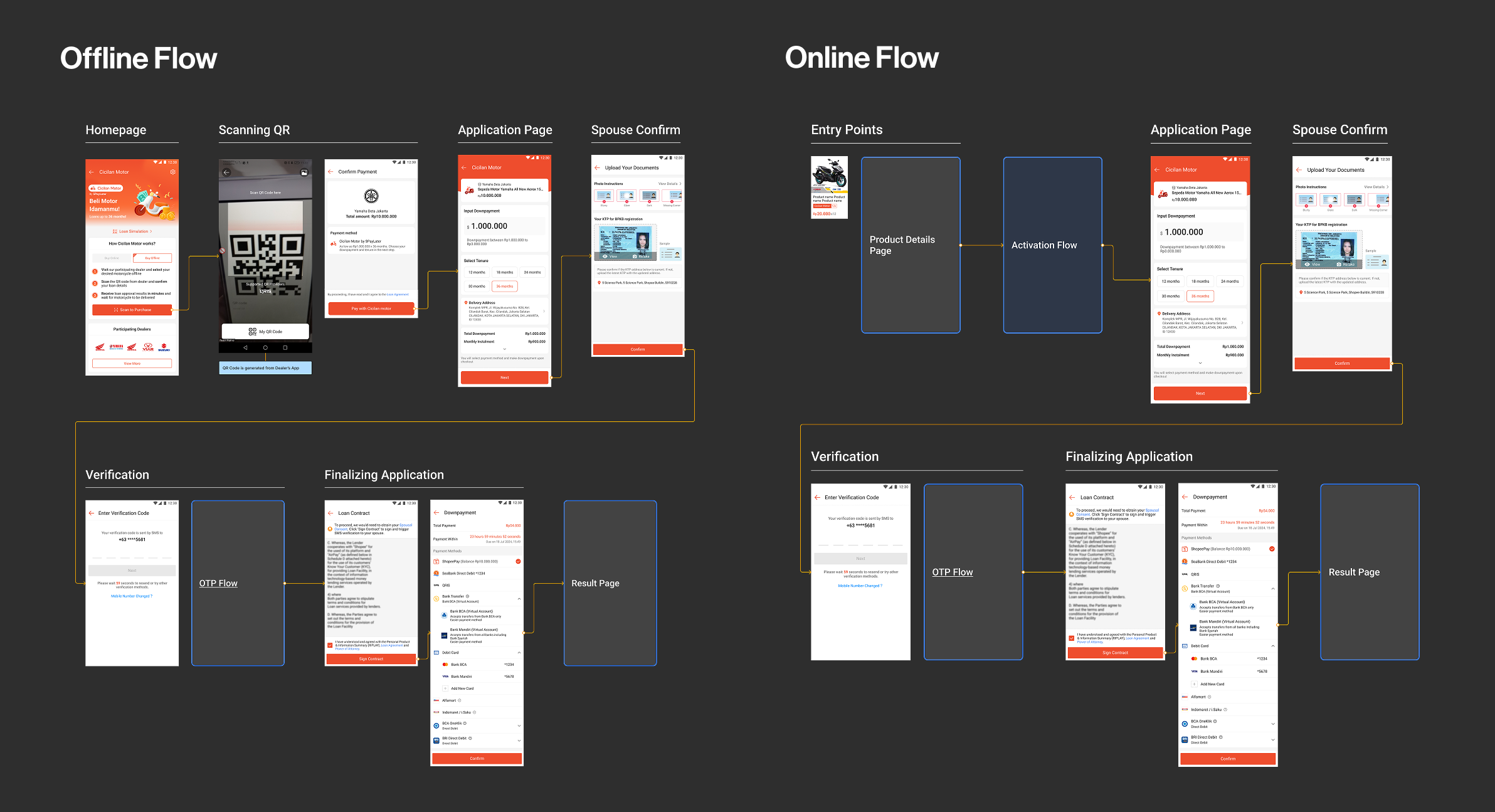
I collaborated with PM and BD to define a Phase 1 journey with two flows:
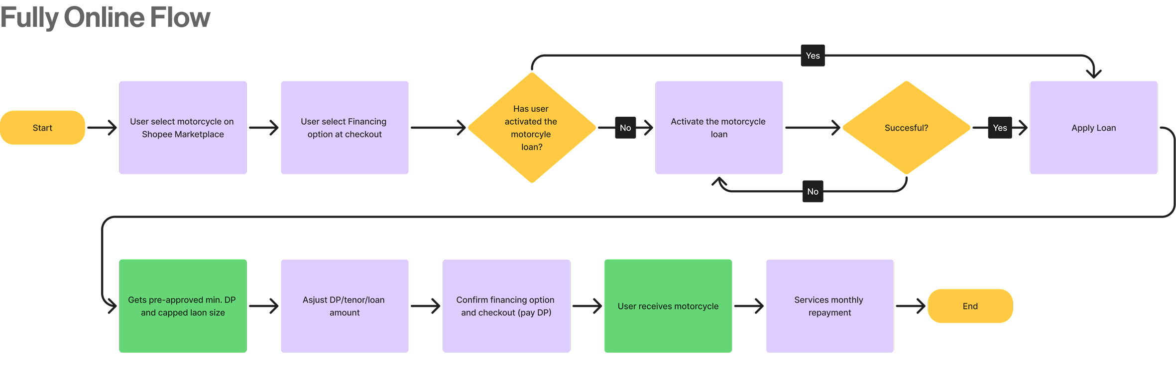
Flow 1:
Fully Online Flow
For users who meet all verification requirements digitally, enabling a completely seamless end-to-end experience without any offline touchpoints.
Flow 2:
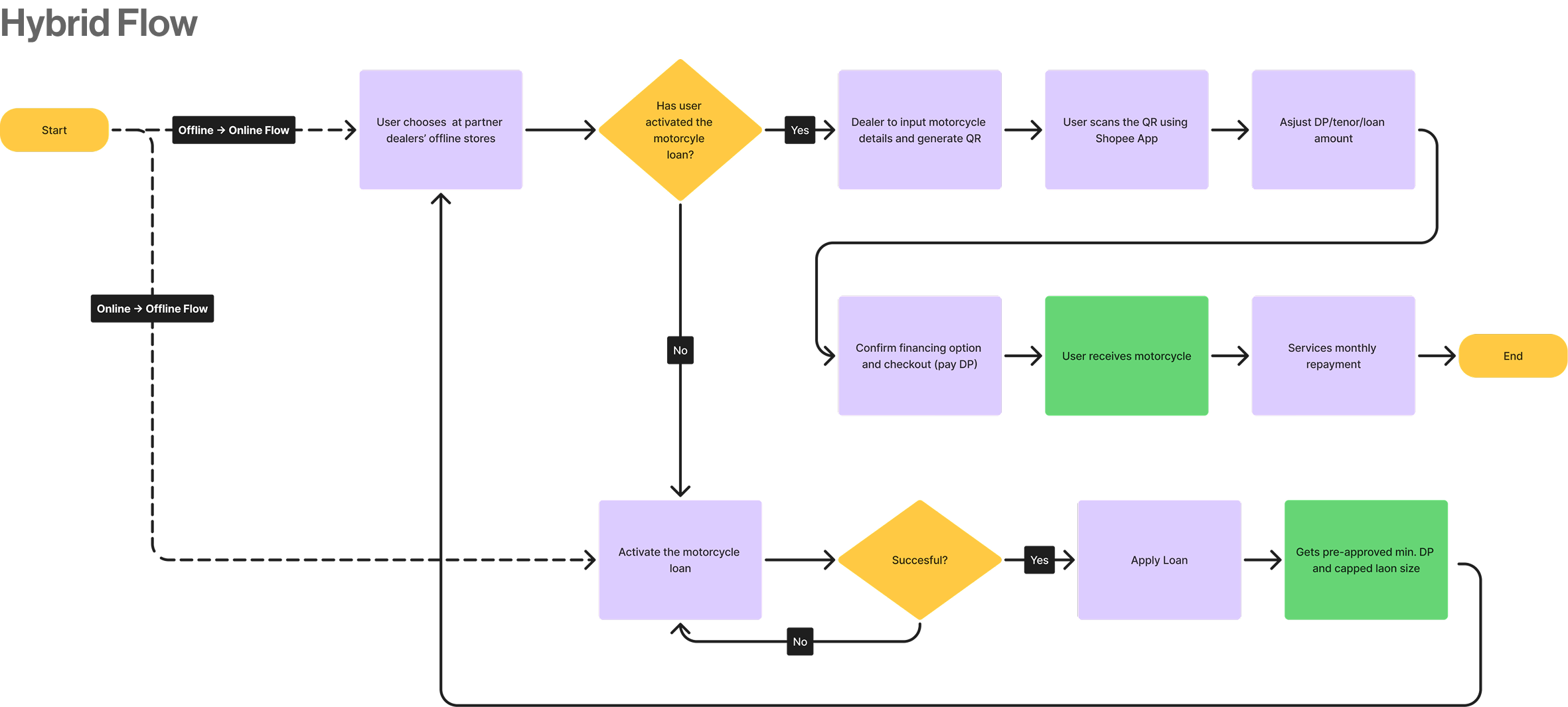
Hybrid Flow
Keeps necessary offline touchpoints for cases where legal verification (e.g., spousal consent, document verification) requires physical presence.
Design Exploration: Part 2
Wireframes + Layout Decision
I created low-fi wireframes for critical screens (landing, post-activation homepage, dealer page), then validated two landing layouts.
Option A:
Long Scroll Layout
A continuous scrolling experience that presents all information in a single flow. While comprehensive, users found it harder to process.

Option B:
Tab-Based Layout
Organizes content into distinct, scannable sections. In A/B testing, 67% preferred this layout because it felt easier to process.

and... the decision was...
✅ We chose Tab-Based Layout
In A/B testing, 67% preferred the tab-based layout over the long scroll because it felt easier to process. The organized structure helped users navigate complex financing information more confidently.
Design Exploration: Part 3
Initial Hi-Fi Prototype
I turned the wireframes into a full hi-fi journey covering:
Complete Journey:
Entry Points → Activation → Purchase → Repayment → Dealer App
The prototype covered the complete user journey from discovery to repayment, including both online and hybrid purchase flows, as well as the dealer-facing QR scan interface.
Usability Testing
We partnered with the local market research team and had moderated sessions in Jakarta, Indonesia. The purpose was to validate whether users can confidently complete the journey and understand what happens next, especially around affordability, verification, and post-submission status.
Method
Moderated usability testing using a clickable prototype, focusing on task completion + comprehension ('tell me what happens next').
Tasks (Scenario-Style)
- "You want to buy a motorcycle on Shopee, but you prefer installments. Find a way to finance it and start the application."
- "Adjust the down payment and tenure until the monthly installment feels affordable, then continue."
- "After submitting, check your application result and explain what you should do next."
Iteration 1:
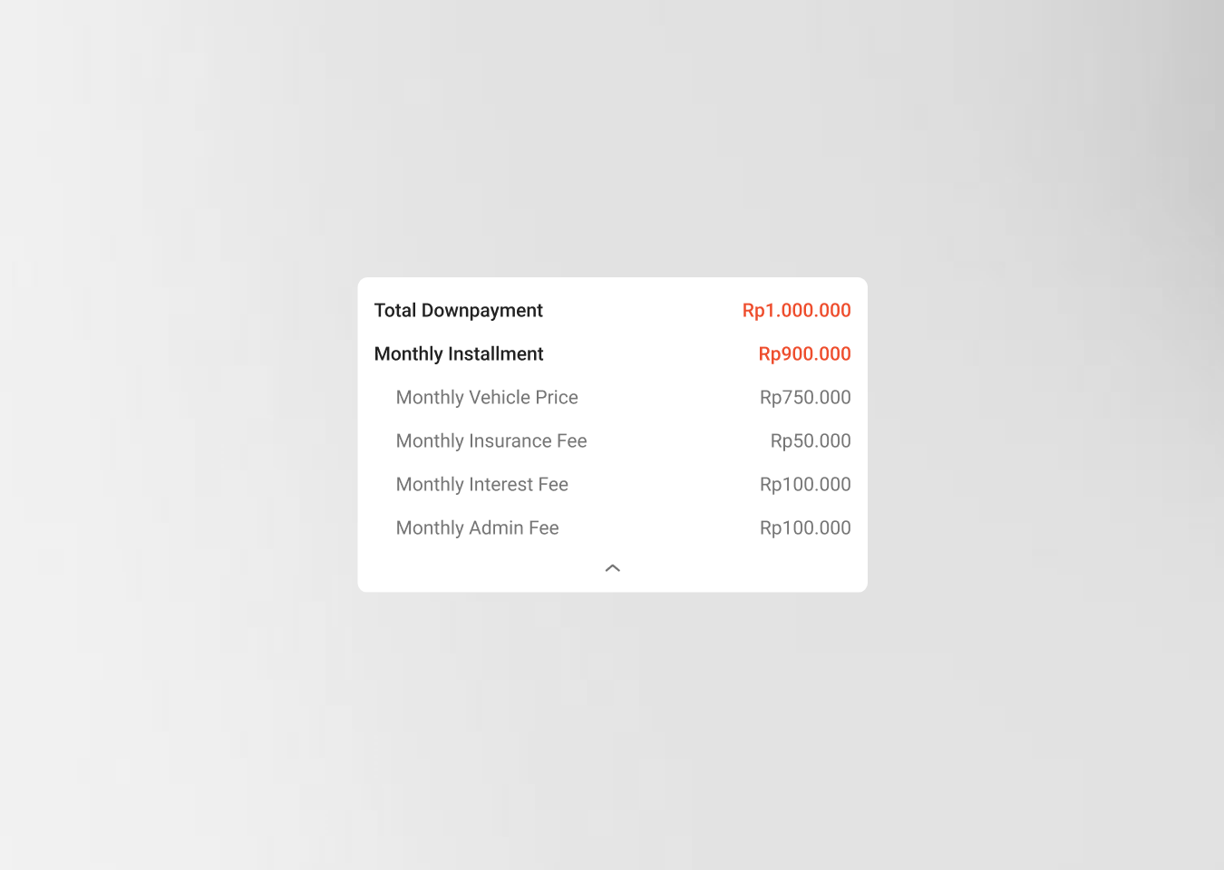
Make Affordability Easier to Understand
Problem
Solution
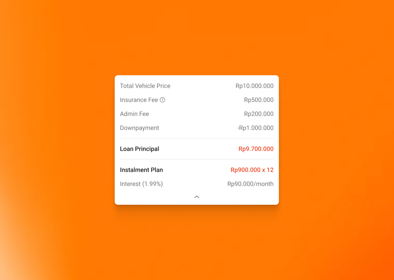
Users needed better control over down payment input and clearer loan visibility.
Emphasized principal + installment breakdown and highlighted key financial details in the simulator to support faster comprehension.
Iteration 2:
Improve Discovery with Strategic Entry Points
Problem
Solution
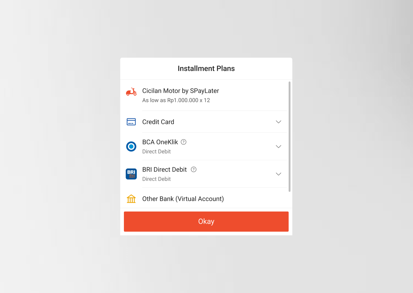
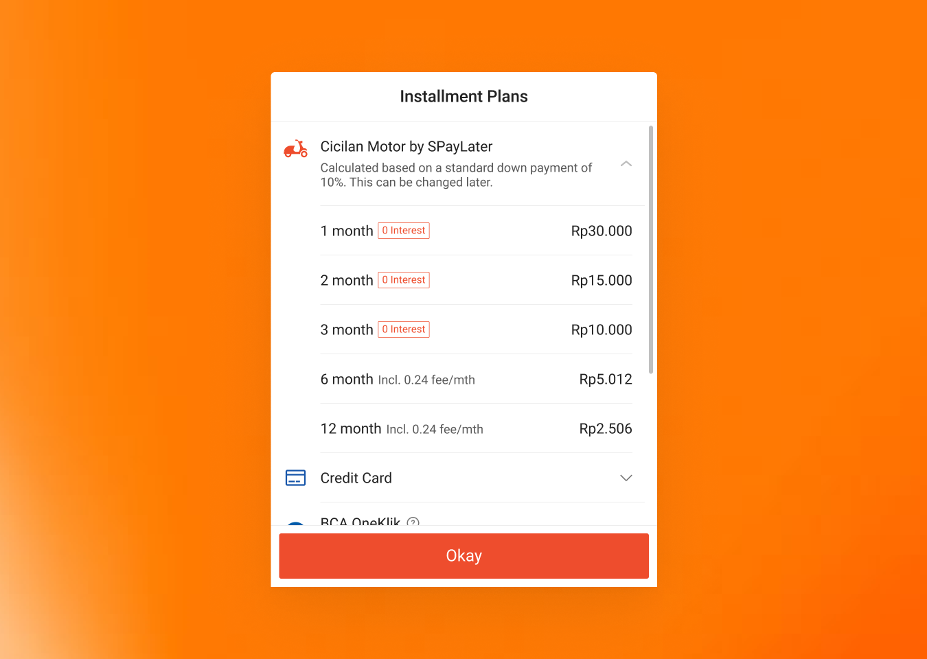
In the payment options bottom sheet, the motorcycle loan appeared as a collapsed row with minimal info ('As low as Rp1.000.000 x 12')—users couldn't compare tenure options without extra taps.
Expanded the Cicilan Motor section by default to show all tenure options (1-12 months), monthly payments, interest badges, and a note explaining the 10% down payment basis—letting users compare plans at a glance.
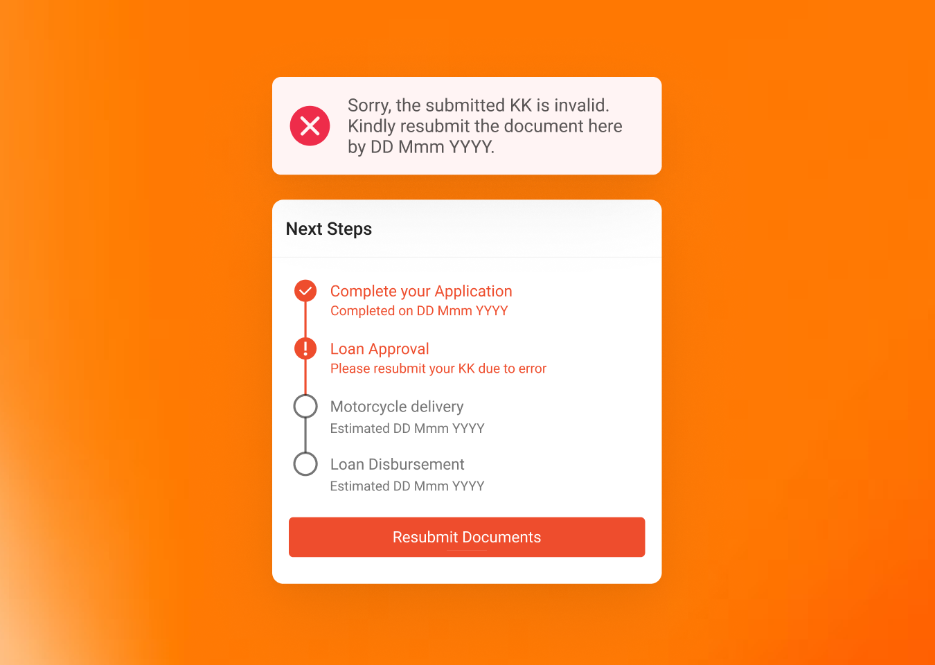
Iteration 3:
Reduce Post-Submission Uncertainty
Problem
Solution
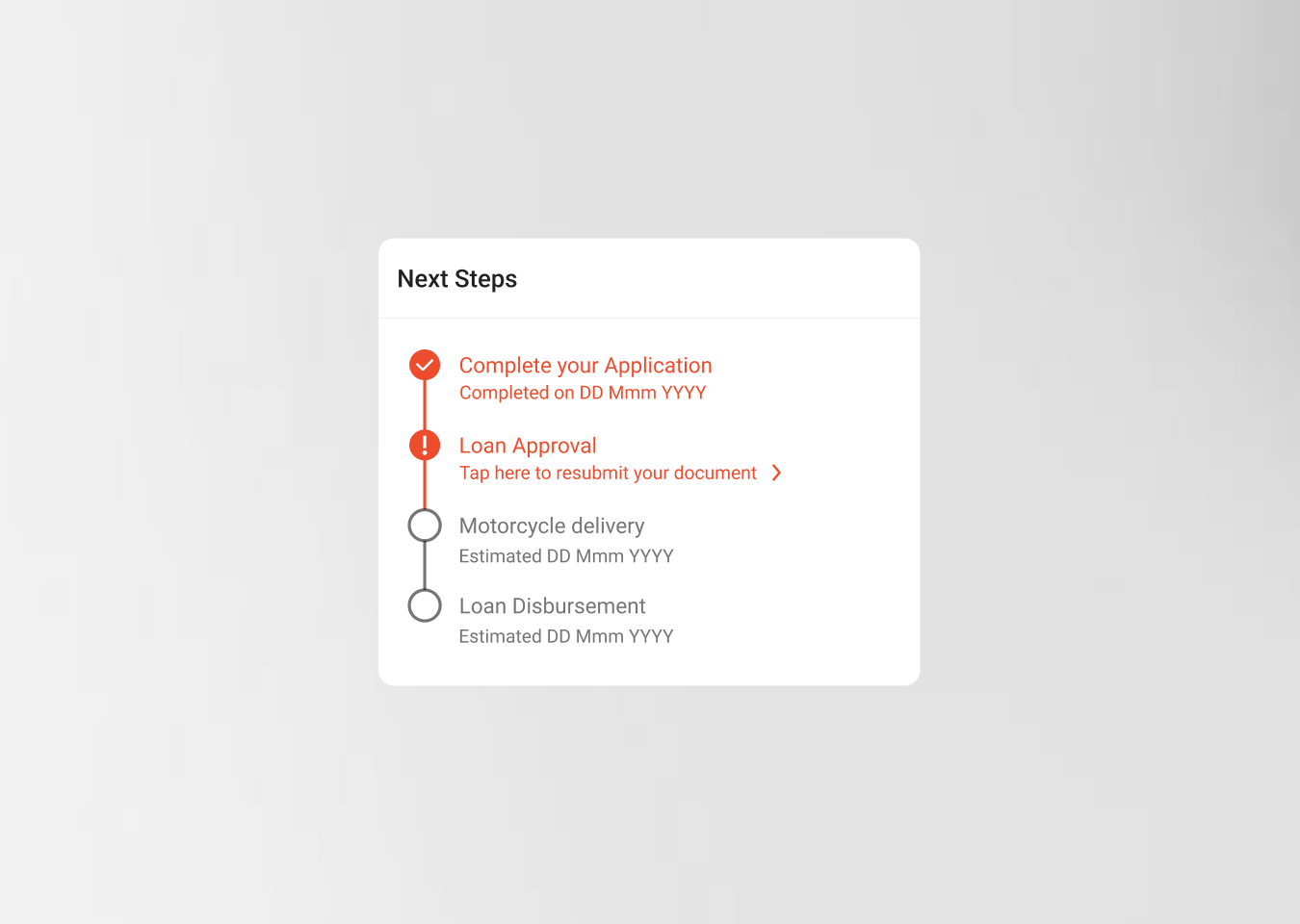
When document resubmission was needed, the error message was buried in the stepper—users missed the required action and felt confused about what to do next.
Added a prominent error banner at the top explaining what went wrong and the deadline to fix it, plus a clear 'Resubmit Documents' CTA button to guide users to the next action.
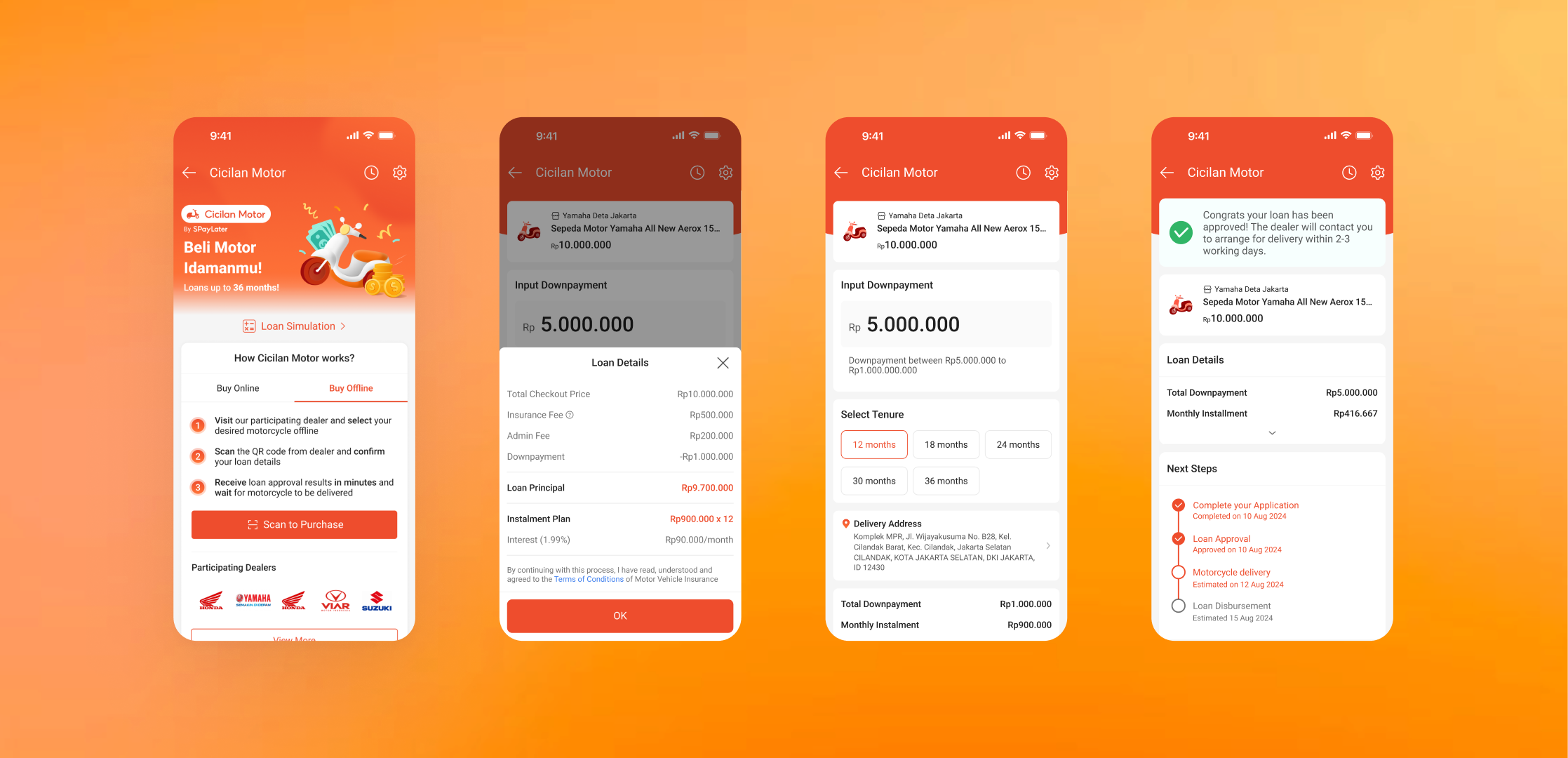
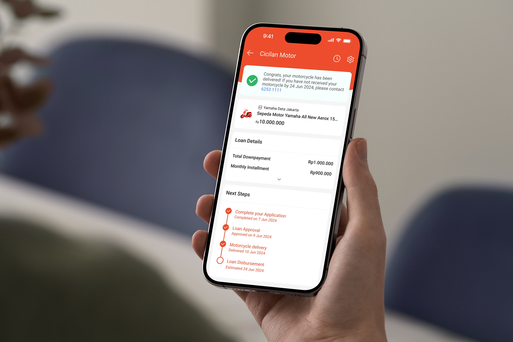
Final Design
The final design delivers an end-to-end SPayLater Motorcycle Loan experience with two paths (Fully Online + Hybrid), strategic entry points for discovery, a clear affordability simulator, and transparent post-submission status feedback.
The Hybrid Flow
The Online Flow
Results & Impacts
Here's what we achieved during the design phase:
✅
Internal Validation
Fellow designers found the design well-structured with no major changes needed.
✅
Stakeholder Approval
PM & BD confirmed the design was pitch-ready and Phase 1-ready.
20+
Dealer Partners Secured
The dealer pitch secured 20+ partners in Jabodetabek, validating adoption potential and go-to-market traction.
Key Learnings

E2E design is edge-case design
The experience breaks where status, verification, and recovery paths aren't explicit—those deserve first-class UX.

Balancing user needs and business goals is a design skill
Solving user friction is necessary, but structuring information to support conversion is also part of shipping.

Simplicity wins in high-stakes flows
Financing is already cognitively heavy—removing unnecessary complexity reduces hesitation and drop-offs.
Future Improvements
Phase 2: Post-Launch User + Dealer Testing
Gather real usage feedback to refine gaps and uncover new pain points after rollout.
Scalability
Prepare variants for other regions and financing models to expand impact beyond the initial rollout.